This checklist defines how the Bricks Component Library is structured, named, created, and governed.
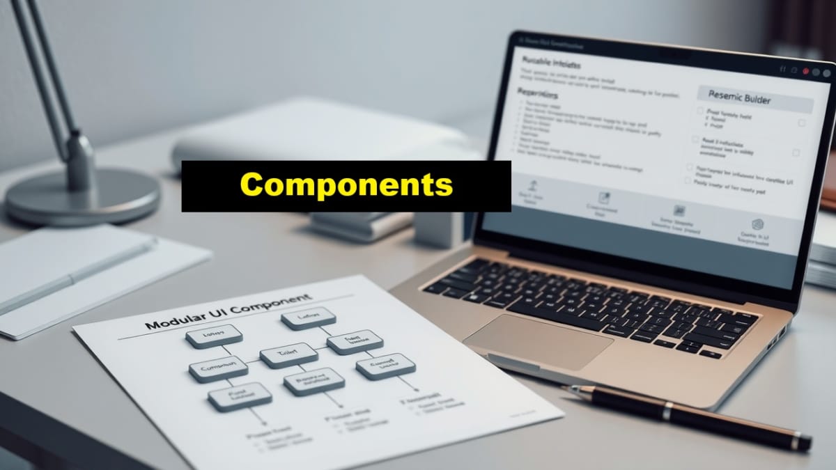
Components are reusable building blocks, not templates. They encapsulate UI logic once and are reused across templates and layouts to prevent duplication and drift.
Checklist Objective
Establish a controlled, reusable component library so layout and template work remains consistent, maintainable, and scalable.
Preconditions
- Bricks — Search Template Definition is completed and approved
- Bricks Builder parent theme is installed and licensed
- Bricks child theme is active
- No reusable components have been created yet
Checklist Steps — Component Library
1. Define component scope and purpose
- Identify UI patterns that appear in more than one template
- Confirm each candidate component has a single responsibility
- Examples of valid components:
- Post meta block (author, date, categories)
- Pagination block
- Search result item layout
- Do not create components for:
- Entire page layouts
- Single‑use elements
- Design experiments
2. Create a new component
- Navigate to Bricks → Components
- Tap Add New Component
- Create the component in isolation
- Do not insert it directly into a template yet
3. Configure component structure
- Use dynamic data where appropriate
- Avoid hard‑coded text, media, or URLs
- Ensure the component does not assume a specific template context
4. Apply responsive behavior
- Switch through all defined breakpoints
- Confirm responsive inheritance behaves correctly
- Avoid breakpoint‑specific overrides unless documented
5. Name and document the component
- Use clear, descriptive naming
- Prefix names consistently if required by your system
- Document the intended usage of the component
6. Validate component reusability
- Insert the component into at least two templates
- Confirm it behaves consistently in different contexts
- Confirm changes propagate correctly
7. Lock the component
- Treat approved components as stable building blocks
- Avoid modifying components during routine content work
- Document changes when modifications are required
Required Output
- Required global components defined and created
- Components saved using approved naming conventions
- Components validated across templates and breakpoints
- Templates free of duplicated UI logic
Pause & Lock
The component library is now locked. All templates and layouts must use these components instead of duplicating UI logic.
Proceed to: Content Systems — Post/Page Structure